Hammond Ashley Violins
Branding
UI
Webflow Development
Within a two week timeline, I redesigned the saved registered user experience, presented my solutions, aligned team members, and handed off to development. This became my favorite project at Brooks Sports, made possible by a product manager who championed quality over rushing to meet deadlines.
I joined a project to guide updated checkout designs done by a colleague through to development. Midway through, I spotted a gap in the saved information design.
Up to that point, I’d been hands-off with the visuals, but I saw an opportunity to not only fix the issue but also streamline the entire registered checkout experience, reducing necessary clicks by 20% and removing potential roadblocks. I brought the idea to my manager, made the case for a redesign, and got the green light.
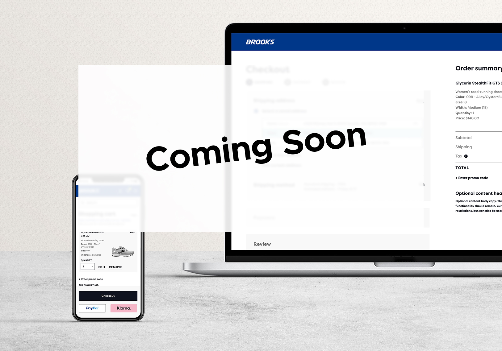
This project is anticipated to be live in October 2025. In the meantime, here's what I did:
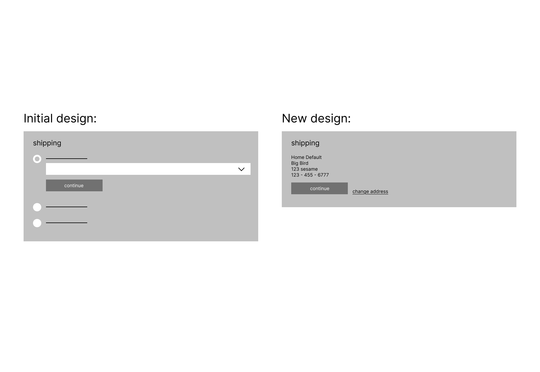
I reduced the number of calls-to-action (CTAs) on the shipping step from four to two by prioritizing the default address in the design. Analytics from the previous 90 days showed that only 1.92% of mobile users interacted with edit/change features on the live site.
In the original design, “select saved,” “enter new,” and “edit current” were given equal visual weight—making it harder for users to quickly confirm their address. In the updated design, the primary action became “Continue to shipping method”, confirming the default address. A tertiary “Change shipping address” link provided a path to make edits without distracting from the main flow.
If users chose to change their address, they were taken to a screen where they could:
Select a saved address (with an “edit” option positioned directly beneath each address)
Add a new address via a tertiary link placed next to the primary CTA
Given that adding a new shipping address was extremely rare, this low-visibility placement kept it accessible without introducing unnecessary complexity. The overall approach reframed “edit” as a feature underneath each individual address, rather than a compete call-to-action, streamlining the experience while keeping secondary options within reach.
While reviewing the checkout flow, I discovered a significant usability issue: editing the shipping address at any point, whether before placing an order or mid-checkout, forced users to restart the entire checkout process. This design choice, recommended by the previous designer, primarily served a very narrow group of customers with military addresses who needed to change their shipping method.
Recognizing the friction this created for all other customers, I advocated for keeping the edit function within the main flow that returned users back to the initial step they were on. I guided this decision into development by clearly communicating its value to both the user and the business, and by prototyping mockups that demonstrated how the improved interaction would work. The final solution allows users to update their shipping address without losing their progress, reducing frustration and keeping them on the path to purchase.
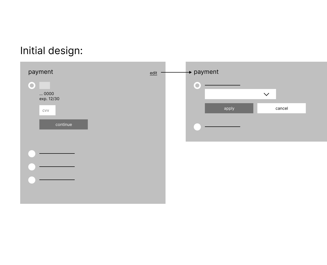
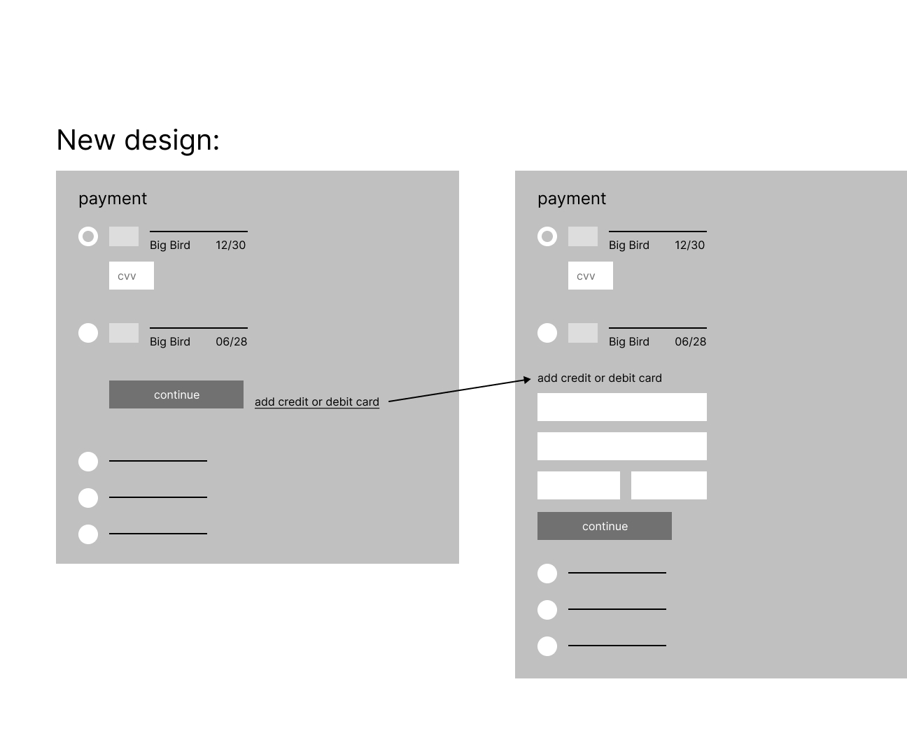
I reduced the payment step from five clicks to three by exposing all saved cards directly in the layout. I requested analytics from the e commerce team which proved that the vast majority of customers had two or less saved cards. This eliminating the need for the initial dropdown layout. To support an experience with exposed cards, I designed a narrower card layout that allowed all saved cards to be visible without extra interaction.
To edit payment in the original design, users slected “Edit”, which allowed them to add a new card or select a saved one. However, due to technical limitations and security requirements, users cannot edit an existing saved card. I reworked the "Edit" CTA to “Change Card” to better reflect the actions (add new or select saved), set clearer expectations, and remove the potential for confusion.
While testing the live site, I discovered a bug in the saved payment method flow. When a user selected “Edit” next to a saved card, they were presented with two options:
1. Select a saved card
2. Enter a new card (this option was pre-selected by default)
If the user navigated back to select a saved card, there was no "Continue to Payment” CTA. Instead, they had to click “Back” (with no confirmation that their selection would persist), enter their CVV again, and then proceed to the review step. This created a confusing and unnecessarily long path, seven steps to complete payment.
I worked closely with the product manager to communicate the bug’s impact to the digital product team, highlighting its effect on both user confidence and conversion. My updated design reduced the process to three clear steps, eliminating ambiguity and making the path to purchase faster and more intuitive.
Given my tight timeline, I relied on UX best practices and industry standards until I later received the analytics that confirmed my design choices. I presented side-by-side comparisons of the old and new designs to my manager, product manager, and project manager, outlining what changed, why, and the results we expected. Their support helped us align with stakeholders quickly and move to development without a lengthy review process. Making for a very rewarding, high speed design chase that finished strong.
These designs are scheduled for development in September 2025, with analytics to be reviewed 90 days after launch.
If you would like to see the full case study, please reach out to me at katelynhenke@icloud.com.